With Google’s so-called ‘Mobilegeddon‘ update in late April, websites are being heavily scrutinized for mobile-friendliness—and potentially demoted from mobile searches if they’re not properly formatted. There has never been a more important time to ensure that your website is compatible with mobile browsers and small devices, and yet a staggering number of small businesses do not have a mobile-friendly website at all.
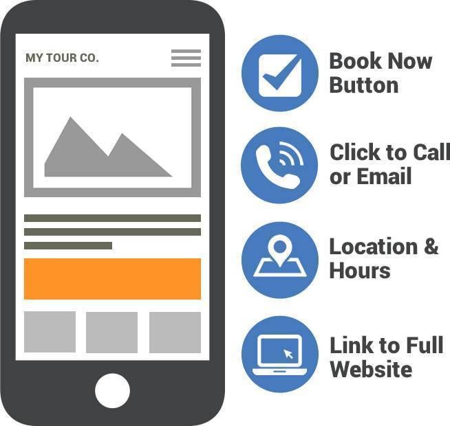
However, it’s not as easy as installing a WordPress plugin or modifying your URLs; like all design, mobile-friendliness is a complex process that will likely require a lot of testing and configuring. With that said, there are four major components that you should make sure you’ve included in your mobile booking website; if you’re going to set one up, these should be first on your to-do list.

1. Click to call/click to email buttons
When customers search on their phones or tablets, it’s very likely that they are on the go and have a high intent to either buy something, visit your store, or ask a question that will determine their interest in your products. You should therefore have large, prominent buttons inviting the visitor to either call or email you—both of which can easily be accomplished on a smartphone. Don’t make the customer highlight your phone number and copy-paste it in order to dial; a simple HTML tag can create a click-to-call link. Wrap your number in an a href tag and use the tel protocol, like so:
<a href="tel:+15555555555">Call us: (555) 555-5555</a>It’s recommended that you include your country code in the tag, so that international visitors will be able to successfully call you without a problem. You can wrap any text with the tel protocol and it should work. If you’re unfamiliar with HTML, there are a wide variety of plugins and services which will install click-to-call functionality for you. You can also create an image and wrap it in the tel protocol tag.
You can create a click-to-email button with the “mailto:” code:
<a href="mailto:me@example.com">Email us</a>2. Location (with map) and operating hours
As stated above, a mobile user is likely searching for you while they’re nearby, or intending to visit. Your location information should be clearly and prominently displayed, and include an interactive map showing where you are and how people can get to you. Google maps are easy to install and using them will increase your ranking. You should also clearly show your operating hours, so that a customer will know whether they can drop by. Don’t make them search for this information; if it’s not clearly available, it’s likely that your customer will go somewhere else.
3. Ability to book or purchase
For businesses that take online bookings through an e-commerce platform like Checkfront, you can and should place a ‘Book Now’ option on your main mobile page—but make sure these elements are already mobile-friendly. People are hesitant to book through mobile devices if the system isn’t optimized properly. Increase on-the-spot reservations by having a secure, fast e-commerce option; Checkfront booking pages are designed render beautifully on mobile devices but if you use one that isn’t optimized for mobile, then encourage your customers to visit your main desktop website in order to purchase. Speaking of which:
4. Link to main website
This is especially important if you have a separate mobile version of your site, rather than a responsive design. Customers will often search for and find you on mobile, and then switch to desktop browsers in order to complete a conversion or find out more information. They may be browsing on a tablet, which will often load the simplified mobile version of your site even though it can handle the desktop size. Include a link to the full desktop version of your website so that it’s easy for customers to switch from one to the other—but don’t force customers to use the desktop version to find out the information described above.
Your mobile website should be simple, elegant, and very easy to read and navigate. The best mobile websites include the vital information that mobile users will need and then link to the full website for more details on individual items or policies. If you have a mobile booking system (like Checkfront), then you stand to increase conversions by including e-commerce components as well. Mobile customers are generally looking for information that will lead them to a purchase; a good mobile website will give them that information and increase your mobile conversion rate.

The State of Mobile Bookings for Tours & Activities
Download this report to learn how mobile usage impacts in-destination bookings.


